Why Price History Charts Exist and What They Actually Track
Price history charts are generated by tools that periodically record the listed price of a product on a given retailer's website. Most capture data daily or several times per week, then plot it as a line graph over a chosen time window - commonly 30, 90, or 365 days. What you see is a record of price changes, not a prediction of future ones.
It's worth understanding what these charts don't capture. They typically record the listed price, which may not reflect coupon codes, membership discounts, cashback offers, or bundled promotions applied at checkout. Third-party seller prices on marketplace platforms can also introduce noise, since the tracked price may shift based on which seller holds the featured listing at any given moment.
For a broader look at how these tools work and their real-world limits, see our guide to price tracking tools.
What you will need
How to Read the Key Patterns in a Price Chart
Once you have a chart in front of you, the goal is to extract signal from noise. The steps below walk through a practical reading process.
Set the chart window to at least 90 days
Short windows distort your sense of what's normal. A 30-day view may show a price that looks low but is actually elevated compared to three months prior. Start by pulling back to 90 days minimum; 180 days is better for higher-value or seasonally priced items like electronics, appliances, or outdoor gear.
Identify the stable floor - not just the lowest point
The single lowest price on a chart is often an outlier: a one-day flash sale, a data error, or a third-party seller dumping old stock. More useful is the stable floor - the price level at which the item sits for extended stretches without moving. Look for flat horizontal segments in the chart; these represent the retailer's default or baseline price at that time.
Examine the peaks and what caused them
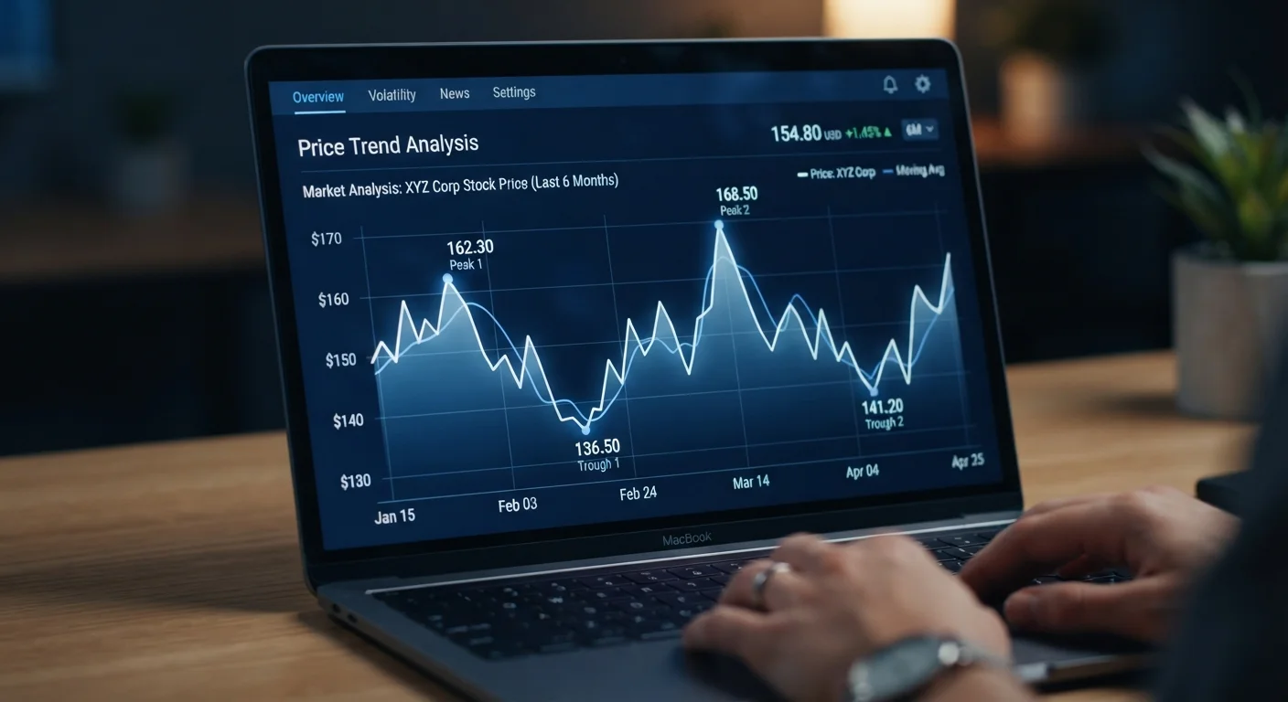
Peaks - sharp upward spikes - generally have one of a few causes: a supply shortage, a surge in demand (holiday season, viral attention), or a deliberate price increase ahead of a promotional drop. Cross-reference the timing of any peak with known retail events or product news. If a peak coincides with a major shopping holiday, the following trough may be a real discount - or just a return to normal.
Compare the current price to the stable floor
Once you've identified the stable floor, calculate how far the current price sits above or below it. A current price that matches or is close to the historical floor suggests the item is reasonably priced right now. A current price significantly above the floor - especially if it recently rose - suggests waiting may be worthwhile if you're not in a hurry.
Check whether the trend is stable, rising, or falling
Step back and assess the overall direction of the line. A broadly flat chart with regular small fluctuations suggests stable pricing - the floor is a reliable reference. A rising trend may indicate increasing demand, reduced supply, or an inflationary adjustment, and waiting for a drop may be a poor strategy. A falling trend could mean an improved model is on the horizon or the product is being phased out - both worth knowing before you buy.
Common Misreadings and How to Avoid Them
Even experienced shoppers misinterpret price charts in predictable ways. Here are the most common traps.
The manufactured trough
Some retailers temporarily inflate a price before a promotional period, then drop it back to near its original level and label it a sale. On a chart, this looks like a sharp spike followed by a descent - but the "sale" price may actually be the product's normal everyday price. Always compare the current price against the longest stable floor visible in the chart, not against the artificial peak.
The recency illusion
If a chart only shows 30 days of data, a price that looks like a historic low may simply reflect that the chart doesn't reach back far enough to show a lower one. Extend the window to 90 or 180 days wherever possible.
Mistaking volatility for opportunity
A price that bounces frequently between two values isn't necessarily about to hit a new low - it may simply cycle. Volatility without a downward trend doesn't mean a better price is coming. Waiting indefinitely for a mythical bottom is a real cost if you need the item now.
Cross-Check Across Multiple Retailers
Price history charts are retailer-specific. A price that looks like a historic low on one platform may simply be the standard price everywhere else. Whenever possible, pull charts for the same product from two or three different retailers before deciding the current price is genuinely favorable.
Understanding price history pairs well with understanding seasonal pricing cycles, since many peaks and troughs are calendar-driven rather than random.
Putting Chart Data Into Context
A price history chart answers one narrow question: has this item cost less before? It doesn't tell you whether the item is good quality, whether a competitor sells the same thing for less, or whether buying it now serves your actual needs. For that broader assessment, our article on what value for money actually means is a useful companion.
Use chart data as a calibration tool. If the current price sits within 5-10% of the historical floor over a 90-day window and you need the item, that's a reasonable basis for a purchase decision. If it's sitting at or near a recent peak, waiting - or checking alternative retailers - is generally prudent. You can also look at where retailers hide their better prices for paths that don't show up on price history charts at all.
This article is for general informational purposes only. Pricing behavior varies by retailer, product category, and market conditions. No outcome - including savings - can be guaranteed by following any price-reading strategy.